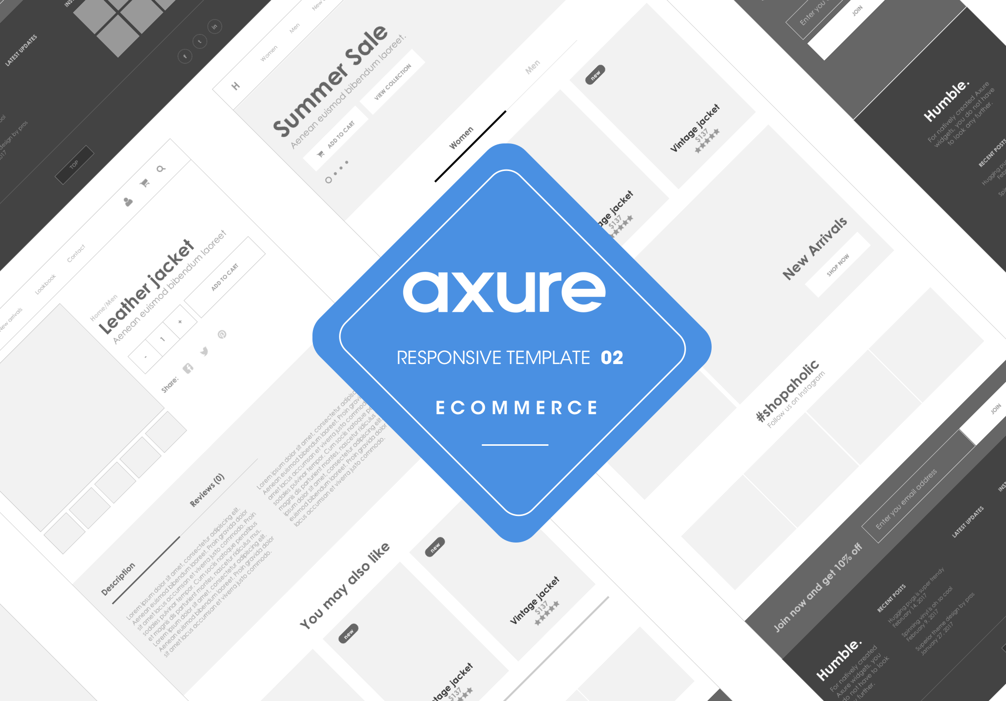
Axure responsive Ecommerce template2
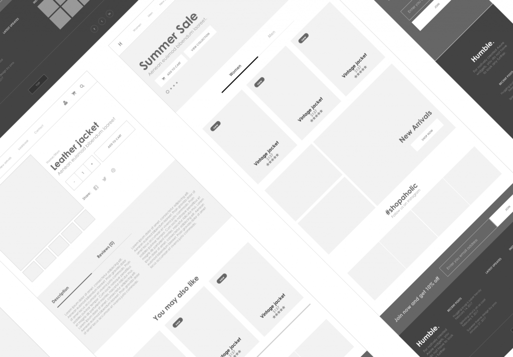
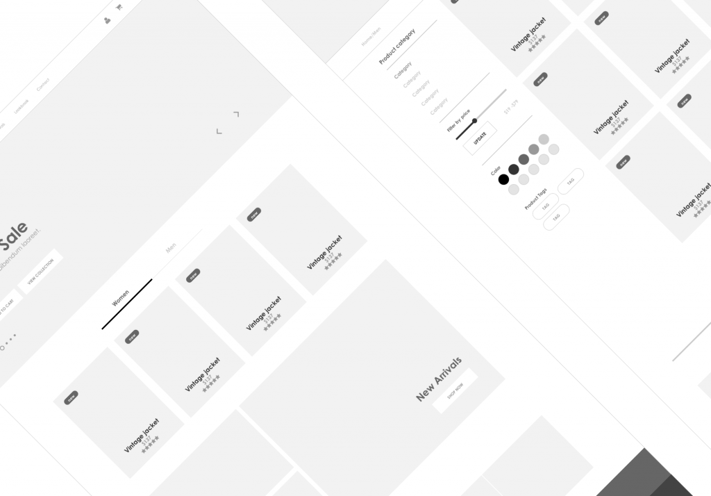
This product is a responsive web Axure template for an Ecommerce website volume 2 that has three views:
- Desktop view designed to width 1200px
- Mobile screen is designed to width 320px
- Tablet portrait view of width 768px
To view the different screens one can preview the Axure file then resize the browser window to preferred dimensions or view on a mobile phone and tablet.
What is this product for?
As every senior designer knows, the bigger the project you are working on the more you need a professional template library to work from. Given most big projects have a tight deadline and clients demand quality high fidelity designs in a short amount, this kit is created for creative designers who are wireframing and prototyping ecommerce/store content for desktop, tablet and mobile views specifically.
Who is this product for?
- UX designers
- Web designers
- UX researchers
- UX consultants/analysts
- Lecturers
- Senior/Head designers managing teams
- Students
What is included?
The file contains
- Home page
- Category page
- Product detail page
- Cart
- Contact pageSEE DEMO LINK


